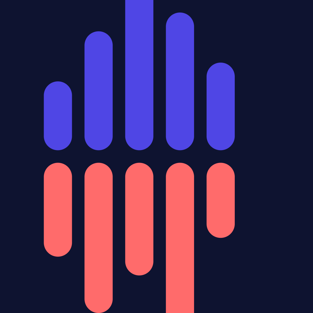
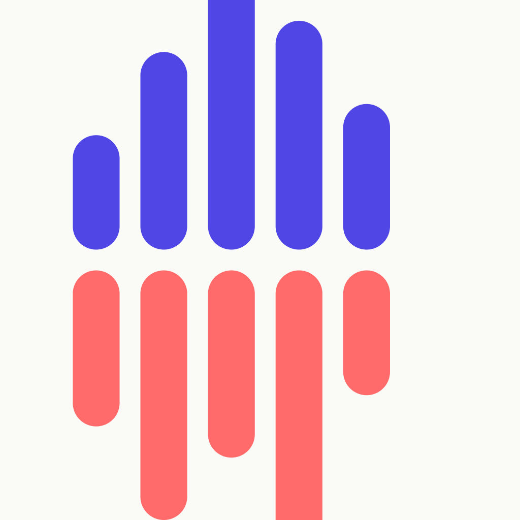
Pulse — two waves, one signal.
The Lingocast mark is two stacked soundwaves — one indigo, one coral — broadcasting in sync. The midline reads as a shared horizon: the meaning that survives translation.
Primary lockup
Mark + wordmark, locked in proportion. Use this everywhere unless space forces the mark on its own.
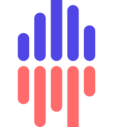
Mark only
For app icons, favicons, social avatars — anywhere there's no room for the wordmark.
Colour
Indigo is the language you know. Coral is the language you're learning. They broadcast on the same midline.
Typography
System sans for everything. We do not ship a custom font.
lingocast
Wordmark — system sans, 800 weight, -1.4 letter-spacing, all lower-case.
Two waves, one signal.
Display — 700 weight, -.005em.
Body copy uses 16px / 1.55 with the system sans stack: -apple-system, BlinkMacSystemFont, "Segoe UI", Roboto, Helvetica, Arial, sans-serif.
Clear space & minimum size
Keep at least the height of one bar of clear space around the lockup. Don't let other elements cross that envelope.
- Minimum size on screen: 120 px wide for the lockup, 24 px for the mark.
- Minimum size in print: 30 mm for the lockup, 8 mm for the mark.
Do / Don't
Do
- Use the full-colour lockup on cream, white, or near-white backgrounds.
- Use the monochrome lockup on photography or coloured backgrounds.
- Keep the indigo on top, coral on the bottom — that ordering carries meaning.
- Allow the mark to live without the wordmark when space is tight.
Don't
- Recolour the bars to brand-foreign palettes.
- Tilt, skew, or rearrange the bars.
- Add drop-shadows, glows, or 3-D bevels.
- Swap the order so coral is on top — it inverts the meaning.
- Set the wordmark in any other typeface or capitalise it.
The story
A bilingual experience is two voices broadcasting at once. That's the literal idea behind the mark — two soundwaves, side by side, reaching toward each other. The midline isn't decoration: it's the moment a listener understands. The dot in the centre marks where meaning lives, no matter which language you arrived in.
We chose indigo because it carries weight without shouting — appropriate for news. We chose coral because it's warm and human — appropriate for a learner. They sit on a cream horizon because pure white is for spreadsheets, and our product is for ears, breakfasts, and bus rides.
The wordmark is set in lower-case to feel approachable, the way a good radio host feels approachable: confident, not formal.
Press & partnerships
Need a higher-resolution master, a different file format, or written approval to use the mark in a publication? Email [email protected] with a one-line description of the use and we'll respond within two business days.